So you want to get into the world of Design but don’t know where to start! Well, as a Junior UX Designer, I will give you some guidance based on my experience to help you get started.
Research, read, listen.
Reading is the first thing when it comes to learning. This also applies to Design as well. Dig the web as much as you can, anything UX related. What I recommend first is:
- Laws of UX: Laws of UX is a collection of the maxims and principles that designers can consider when building user interfaces, written by Jon Yablonski. A must-read in the Design game, especially for Junior UX Designers.
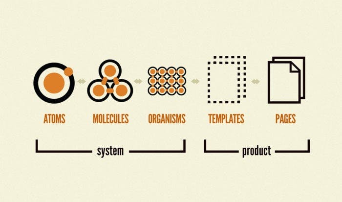
Atomic Design: Atomic Design is a book written by Brad Frost about how atoms, molecules, organisms, templates, and pages concurrently working together to create effective interface design systems. You can buy it physically or digitally. - Design Principles: Design Principles are a set of considerations that form the basis of any good product. You will find 195 examples of design principles from 167 different creators. A few simple principles or constructive questions will guide you towards making appropriate decisions.
- Medium is a site full of articles about Design, Development, and much more. You can find Case Studies, Questionnaires, Tips and instructions. On the same level as Medium is UX Planet, another website that has stacks and stacks of articles to help you get started.
- Podcasts: There’s a ton of podcasts out specifically for Design. Spotify has a Podcast section with more than enough content to choose from. I recommend Design Matters, a show hosted by Debbie Millman, Junior UX Designers will receive a ton of information, and it’s the first-ever Design Podcast.
- UX Research: The main goal of UX Research is to inform the reader about the design process from the user’s perspective. UX Research has two parts: gathering data, and synthesizing it in order to improve usability. At the start of the project, design research is focused on learning about project requirements from stakeholders, and learning about the needs and goals of the users.

Tools.

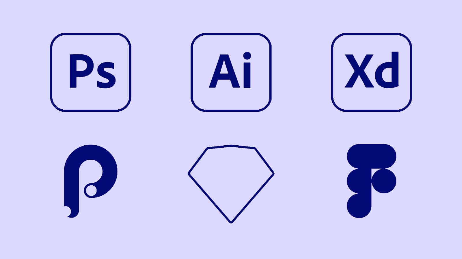
Once you’re done with the steps above, it’s time for you to start putting it to work. There’s a ton of tools to choose from, Sketch, Figma, Principle, XD, Photoshop, Illustrator. You decide what to pick. My opinion is that if you know how to use Photoshop & Illustrator it’ll help you understand the rest easier. I’m not saying you have to, but it’ll be slightly easier for a Junior UX Designer. Sketch is a pretty easy tool to use with plenty of tutorials to help you learn everything. It has many plugins and has an infinite amount of space to save files.It’s only for Mac that makes it hard for some people to use it but other than that it’s great. Figma is a real-time Design tool. Has unlimited storage space, more than enough plugins to download, and the real-time feature lets you collaborate with your whole team and colleagues easily. It’s a browser-based tool which means you can use it pretty much in any device through the web. You can also download the Figma Software for more features. Principle is a Macintosh-only UX Prototyping tool, allowing you to prototype pretty much anything you like. You don’t design in Principle, you prototype only. Like some of the previous tools, Adobe XD handles complex design systems and symbol libraries. It also features intuitive tools for easily connecting screens and creating interactive prototypes that can be utilized in user testing without the need for code.

Do’s & Don’ts.
Most of the time, you have to take into consideration multiple things while designing a product. Design can be overwhelming for the Junior UX Designers as well as the users if the to-do list is not obeyed in lines to the problem statement.
Do’s:
- Understanding your users: User Experience (UX) relates to having a deep understanding of users, what they need, what they value, their abilities, and also their limitations. UX includes all aspects of the user’s interaction with the company, its services, and its products. If you start designing before understanding the background of your users, it leads you to a dead end.
- Agnostic Experience: These days, it’s quintessential to be Device Agnostic. It’s not a choice to design the UX for single platforms. Responsive UX is required for businesses that want to succeed.
- Single focus of attention: Some designers tend to incorporate more than enough information on a single screen. Try to design screens that your users are able to clearly figure out the flow of the product with a single point of focus.
- Prioritize features: Designers are often forced to add features even if the design is already full! This can be overwhelming for new users. For a design to be successful, try to have a limited set of features that are solving your major problem statement.
Clear the clutter: The more elements are shown on a screen, the less aesthetic the screen is rated. The functionalities must be the features most important for the platforms’ proper functioning. Let the user navigate easily. The information must be in such a way that it requires a minimum number of steps to reach the destination.

Don’ts:
- Filling screens with irrelevant information: Users expect everything to be explicitly stated without wasting their time and energy. Giving irrelevant information will only frustrate them.
- Asking permissions right at the start: Users often deny such permissions requests because, at the very beginning, the users don’t have any context to make a decision. They don’t know why your app needs those permissions. It’s better to ask for permissions in context and communicate the value the access will provide. Users are more likely to grant permissions if asked during a relevant task.
- Too many gestures: This limits the user interaction with the app. Sometimes these gestures can be the supporting mechanism for the mobile app. However, it is best to avoid too many gestures and stick to the standard ones. The mobile user needs to see standard symbols and controls for the common actions to be able to recognize them easily.
Dead-end pages: A dead-end on the product is the biggest turn-off for a user. Dead ends act as blockers for user flow.
Tips.

While it should be obvious that UX is essential to product design, some Junior UX Designers still have a lot of misconceptions about it. These tips cover the fundamentals of getting the UX Design process right on a theoretical level:
- Don’t reinvent the wheel: There is a reason why most websites and mobile apps are designed the way they are. Why? Because it works. People are used to it. Some Designers often fall victim to a mentality of reinventing the wheel. That’s the psychology of perpetuated habit. Users are used to the conventional mode of presentation and don’t like adapting to something different.
- Keep it simple and practice responsive design: “Too much” is an instant User Experience turn-off. When the user gets to a page that is literally full of distracting elements, the end result is the user bouncing off somewhere else, which is the opposite of what you want. Try not to distract them from their goal, and you’ll achieve yours.
- Understand your target audience’s needs and demands: Understanding your audience’s needs and demands might seem like an obvious tip. UX Designers can’t figure out the right UX Design scheme without understanding the needs and demands of the target audience. How to do that?
a) Gather feedback from your users via surveys, questionnaires.
b) Observe how users use similar products. - Make different elements visually distinct: A visually distinct page layout is one of the most important things for a UX Designer. It is always a good thing when you don’t need to think about how to find or do something but instead. simply do it. Here are some tips that may come in handy during the design process:
a) The most valuable information needs to stand out the most.
b) Users need to be aware of their location on the app.
c) Action buttons need to stand out.
d) The search field needs to be visually distinct from the word “search” and the magnifying glass in it. - Maintain consistency of the User Flow throughout the journey: One of the most important aspects of User Experience design is the flow, the smooth navigation of the user’s journey. In design terms, flow is when the user moves from one section of the product to another.

We are really glad that you stayed until the end. Therefore, we have something extra for you.
Follow this LINK to get access to some great resources and ideas for your designs.