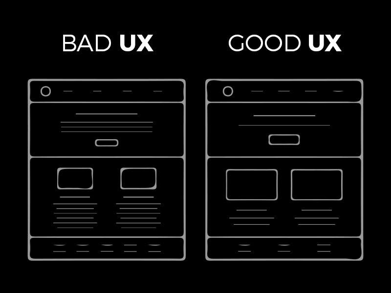
Have you ever thought about why the role of UX Design in business is so significant? How are giant corporations and startups affected by them? UX Design is the aspect on which businesses rely a lot in order not to lose the client. The consistency and efficiency of a website’s architecture are the variables that can attract a customer or push them away.

“You’ve got to start with the customer experience and work backwards to the technology. You can’t start with the technology and try to figure out where can I sell it.”
-Steve Jobs
About Small Businesses
Even if giant firms are at an advantage because of their larger budgets and the current image of the brand, this does not mean that smaller companies and start-ups are doomed. In fact, because your website doesn’t have to be so packed, your small business can have a major design advantage. What you need to is to make sure you give your customers a simple, informative website and they will definitely become regular customers.
Thinks to keep in mind
If your website’s UX Design is done correctly, it’ll bring more traffic, will help maintain existing customers, and ultimately acquire more. Providing your users with a well-designed and smooth-to-navigate product or service will make them want to obtain it more and more. Consistency is key, having a nice level of consistency will help the users to understand and get comfortable with how to use it.
Perfect UX Design is a critical factor of your company’s online presence. Your visual and experiential identity must feature an efficient and well-calculated design in order for your company to thrive in the online world. Keeping this in mind, you need to treat your product’s/service design the right way and not consider them an afterthought.
Things that will drive users away
- Confusing newsletter subscriptions:
One of the worst things that can happen to a user is to be subscribed to an unwanted newsletter and the process of unsubscribing from it be tedious and difficult. From having small unsubscribe texts that are “hidden” buttons to not even have an option for it on the newsletter. - Missing navigation buttons (go back, continue, etc.)
Imagine navigating through your bank’s website, finding yourself deep inside the transaction history section from some months ago, and not being able to go back to the main dashboard due to missing the back button. - Information overload
There are also instances where you have to plan a ton of data to be seen in a small space. What solution is there to this? Two things. Try to decrease the abundance of information, consider what users need and design based on that and turn details, instead of text into visuals.

In UX design, the emphasis has changed from merely designing a tool to allowing the subconscious responses of the user to direct the tool’s production so that it responds to the needs of the user. It’s a much more natural way of designing, much less subjective. In the early days of Amazon, Jeff Bezos popularized the term user-centric. But what is the term user-centric design? It is when the design is based on an explicit perception of users, tasks, and environments. It is an approach. It is guided and refined by user-centered appraisal and discusses the entire experience of the user. Throughout the design and production process, the process requires users, and it is iterative.
Changes that cost
- Walmart lost 1.85 billion after changing its UX. Walmart is a global American retail organization that owns a hypermarket chain, discount department stores, and convenience stores. The business was founded in 1962 by Sam Walton. In 2009, Walmart asked its clients a simple question: “Do you want Walmart to be less cluttered?”, people replied with an even simpler “yes”. Walmart then spent millions removing surplus inventory from their stores, clearing aisles, and shortening their shelves. That made Walmart have more space and made their clients hate it. Even though it only removed 15% of its inventory, sales plunged, resulting in a loss of 1.85 billion dollars. The team responsible for this initiative was disbanded, and since then, Walmart has sought to regain its old ‘cluttered’ appearance.
- CNN redesigned their site in 2015. Having the same website until then, they brought a scent of fresh air with the new one, it was clean, modern, and beautiful. Users hated it, as it had loading times even longer than the old one, a whopping 20 seconds, all because of all the website’s big pictures. Much of the room was filled up by the photos, meaning individuals did not see the headlines and were forced to scroll down a lot. In the same room, the new design showed half as many clickable stories and took 20% of the CPU to load the home page.
Having a clean website matters, but don’t get fooled and remove critical information and functions. Interviewing users, surveys, direct feedback, and observing market trends are some of the ways you can use to understand your users because remember, UX is the product.