The user experience of a digital product by definition includes the user. The user thankfully (yet) is a human being that can click the three squares with traffic lights on google captcha. A human being by definition and experience is a super complicated system of beliefs, memories, feelings, habits, and behaviors. Globalization hasn’t turned us into a uniform mass of customers (yet, again!). So it is evident that users of a digital product are complex, unpredictable, explorative with a vast selection of personal beliefs and ethical standards.
So what exactly can a designer do?
(Hint: everything)
As a member of the wonderful UX world, I keep getting in awe whenever I realize how elements, components, and flows that I design affect the daily routine of some individuals (aka the end-users). That also puts a burden on the shoulders of every UX designer: How should I use this power to affect other people’s lives?
So why is this even a debate? We just should be nice. End of story. But… (the omnipotent and dreaded but) users are also clients. We rely on them to return the investment, to create profit. So we have to enhance their desire to acquire our product.
At this point the magic words “Ethical Design” appear from nowhere like a detail in a Bob Ross painting. Ethics as noted at Cambridge Dictionary is “a system of accepted beliefs that control behavior, especially such a system based on morals”. As stated before users are complex and unpredictable so there is room for debate on the boundaries of ethics and what is considered right and what is not. That’s how we end up to the urbandictionary.com definition that “Ethics is morality with loopholes”.
Let’s try to find out how a UX designer can balance between good moral choices and incorporating elements that will turn users/visitors into clients. Before doing that though, we should all agree on what we should avoid at all costs.
Extremely Wicked, Shockingly Evil, and Vile
A Ted Bundy movie (not)
Dark UX Patterns for apps and websites (don’t try this at home)
As stated by Gray et al. in their 2018 scientific paper from Purdue University, Dark Patterns are “instances where designers use their knowledge of human behavior and the desires of end-users to implement deceptive functionality that is not in the user’s best interest”.
This deception is usually achieved with one of these tricks (as stated by Harry Brignull the UX specialist who first coined the term ‘dark patterns’ in 2010):
1. Trick questions. Usually based on confusing language patterns like a double negative. Usually takes place while registering for a service.
Using this phrasing and because people skim-read while online the first reaction of the user that doesn’t want further communication will be to concentrate on the “Sky may contact you…” and quickly make the assumption that if you don’t click on the checkbox you will not be contacted. Careful reading will make it more clear that opting out is achieved by the opposite action.

Two seemingly irrelevant images
2. Sneak into Basket. Self-explanatory this one. We all have sneaked in a bubble gum package in our parent’s shopping cart hoping that they will notice only in front of the cashier when we were kids. The same technique is applied to the virtual world also. While you buy something you end up paying for something extra. The most common case these days is when you buy or renew a service like a domain name for example (GoDaddy pre-selects an additional option called Privacy Protection when users purchase domains) or the landmine of avoiding preselected extra options when purchasing an airplane ticket (like insurance, extra luggage, etc).
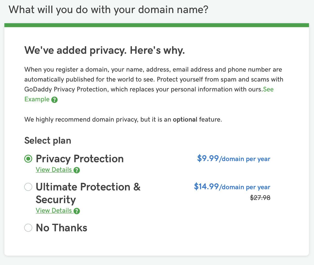
We know better than you what you want
3. Roach Motel. It is when by design you help the user “get in” effortlessly and fast. And then still by design, you make it as difficult it can be to “get out”. It is a very common practice in the digital and physical world.
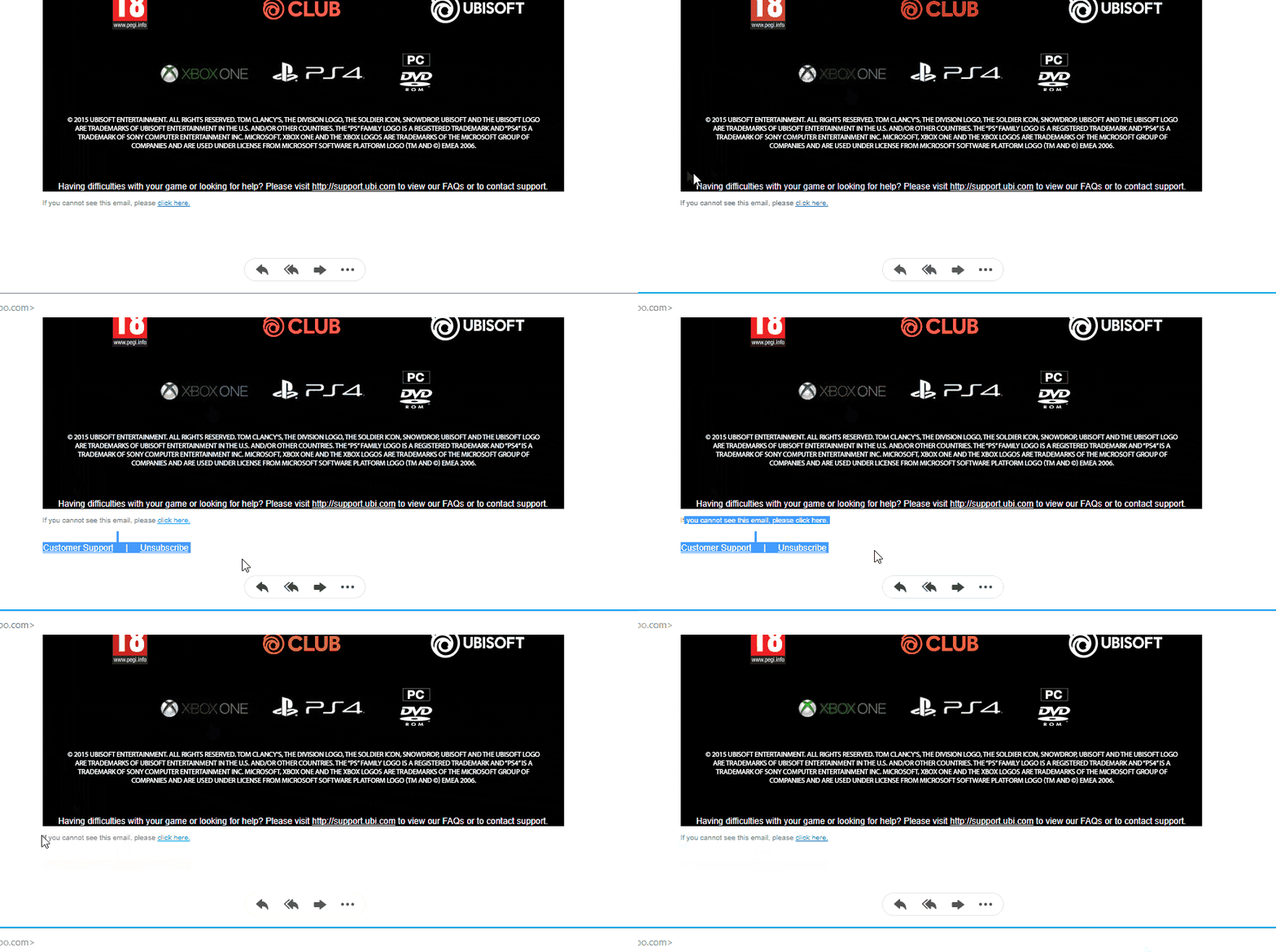
Exhibit A. Enough with this newsletter! Let me hit that Unsubscribe button…
Even on popular platforms, this pattern is prominent. If you google for articles on how to close your Amazon or Facebook account, you would be amazed by the arduous process. Most of the examples of dark patterns fall into this category. Especially with the most strict EU laws about cookies, consent, and GDPR. On Fastcompany website, there is a very handy and well-designed button to accept cookies from all affiliates. Just a click and you are done! Quick and thoughtful. But let’s examine the case that you are a more private person and you don’t want to be tracked by affiliates. I would expect a rather easy flow for kindly declining. Well, actually you have to opt-out one by one from 680!! Trackers and options.
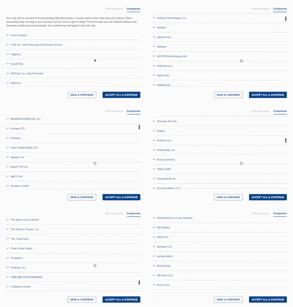
Exhibit B. Wanna opt-out? Let’s hope your index is well trained for scrolling (via @lowresolution)
4. Privacy Zuckering. Rad name! An homage to Facebook CEO Mark Zuckerberg and the infamous difficulties that the early users of the platform faced in controlling their privacy, ending up in “oversharing” information.
This pattern was a thing from 2009 – 2015. Fortunately, things are more transparent nowadays! Today, privacy zuckering seems to take place mainly behind the scenes, thanks to the data brokerage industry. Essentially, they are companies that collect information from public records, online activity, and purchase history, and re-sell it to other companies for marketing purposes.
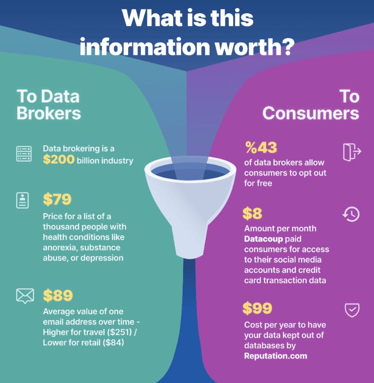
To keep your data private seems like a rather expensive sport (source: WebFx)
5. Price Comparison Prevention. Users/clients want to make informed decisions while shopping. They search for the best deal. They compare prices/plans/costs/savings. So what do you do if you know beforehand that comparison might not be in your favor? You end up using this dark pattern. Make a comparison between two items difficult or even impossible.
This is widely used in the real world at supermarkets with so-called offers and bundles where the price of each unit isn’t visible (and can easily be higher than the price of the single item). Online retailers that don’t include a per-unit price at bundles follow the same tactic. Another example of this pattern is Linkedin where one can claim their marketing is rather aggressive when it comes to buying a premium subscription (it is a solid 8 on a scale from “Zero selling effort” to “Buy a Premium YouTube account”), but there is no pricing on the plans they want you to try. So it is easier for users to agree on a plan with a price they wouldn’t normally choose.
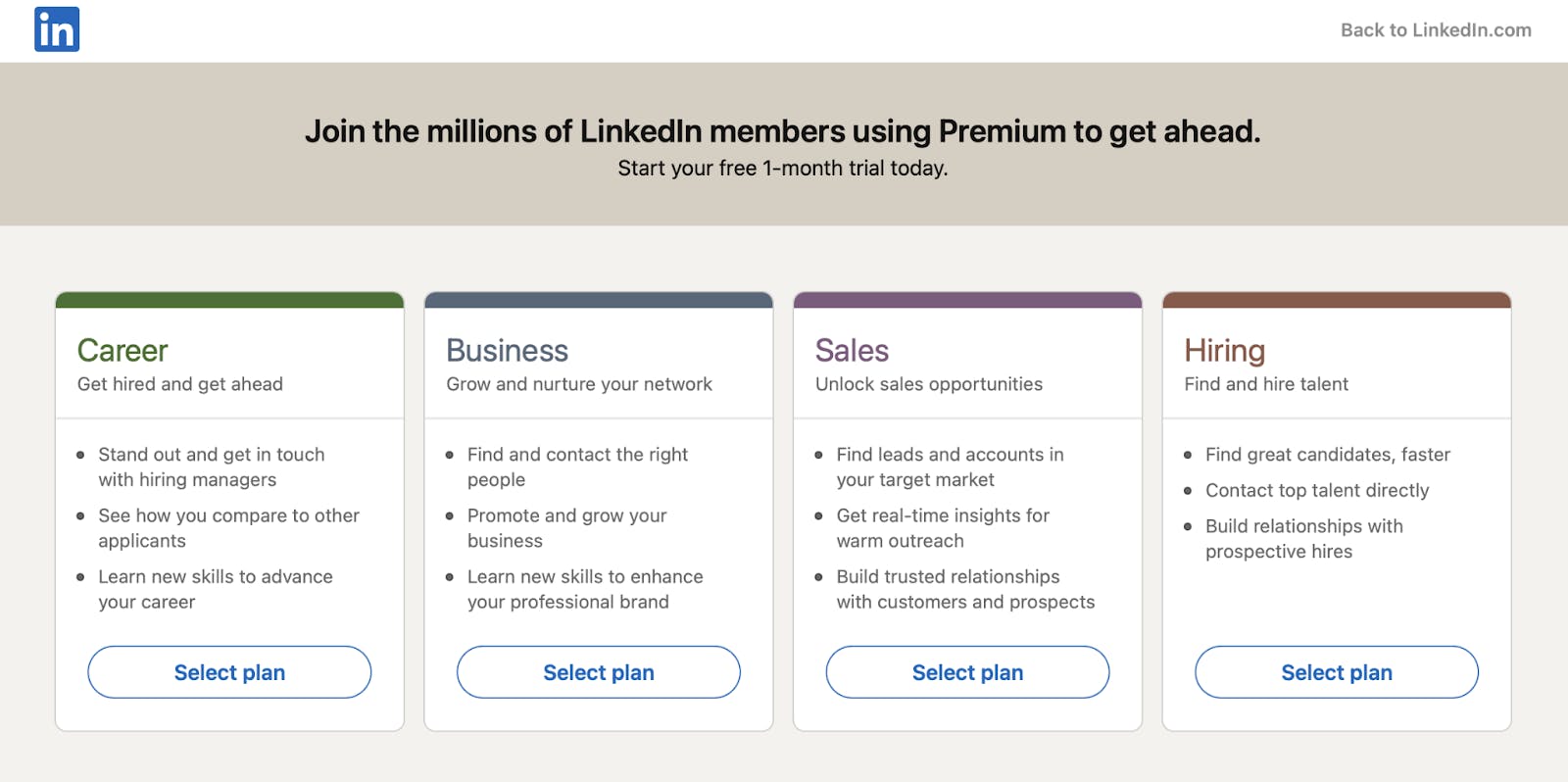
Buying with your eyes closed
A study from StubHub showed that users who weren’t shown fees upfront spent ≈21% more and were 14% more likely to complete a purchase!
6. Misdirection. It’s one of the oldest tricks in the book. We all have seen an action movie where the protagonist throws a rock in the direction opposite from him to catch the guard’s attention away from him and slip into a building. The same happens when you try to install software and you end up installing some add ons or affiliate programs along the way.

Not only they try to trick you install Bing search bar, they take it a bit further with an extra 12 seconds delay!
Another example is with the mobile game Two Dots and its deceptive use of the green button UI element. As the splash green loads, you have to press a green button to proceed. When you have selected the level you want to play, you have again to press a green button to proceed. Before beginning the selected level take a wild guess of what action you have to perform in order to proceed: Pressing a green button!!
At this point, the player is pretty confident that pressing a green button proceeds you to the next screen. Until you lose a level. Then the green button leads you to buy Moves and a small white X marks the normal proceeding flow.
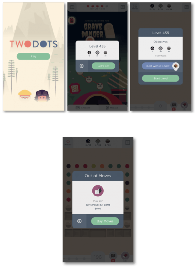
(Source)
If there were awards for dark patterns, this would surely be a strong contestant 🙂
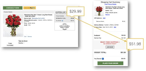
7. Hidden costs. Imagine selecting an item at 10$ cost, go through a 5 step checkout process (including completing your credit card info) only to discover at the last order review step that there is a handling fee of 5$ and another 12$ fee for shipping, mounting the total to 27$. Stop imagining that. It pretty much happens very much. For some strange reason, lots of online flower shops follow this pattern as beautifully shown in this article from measuringu.com
Another undisputed king of hidden costs is Ryanair and its “low cost” airfares that can very easily turn into full-price ones. You can watch this helpful video on what are these hidden costs and how to avoid these hidden costs (Viewer’s discretion advised. Contains possibly offensive language & gestures. May also cause increased heartbeat on female viewers)
8. Bait and Switch. As I was writing this article after work, happened to watch the film Coming 2 America with Eddie Murphy and there was a scene where they were explaining the Bait and Switch selling technique. So one can guess it is well known and established both in the physical and the digital world. This pattern is plain and simple when the user sets out to do one thing, but a different, undesirable thing happens instead.
We have a strong contestant in this category with Microsoft and the Windows 10 upgrade process. It is widely accepted that when you click the X at the top right corner of a pop-up box, you opt out of this window’s question
Microsoft decided to reverse this convention and clicking the X made the surprised users agree on the upgrade! This isn’t the case anymore but this move broke the trust with users in such a way, that the Windows Upgrade process became meme material (and not in a good way).

9. Confirmshaming. The act of guilting the user into opting into something. A popular pattern especially in sign-up processes. Usually, there is a bold CTA for signing up in a mailing list and a more subtle cancel button that shames the user if she happens to decline the offer. If you have the time you can see a variety of confirm shaming examples in this fine blog. For those with normal life and habits and limited time a selected fine example of this dark pattern follows:

10. Disguised Ads. Usually, ads on a website are bold and intrusive. You can get what is content and what is an advertisement. Some designers make ads so subtle and similar to content’s UI so that some users end up clicking on the ad believing that they click on content. There seems to be a consensus that the champion of this pattern is softpedia.com. A website where you can download free or freeware software. The ads are so well placed and designed that easily a hasty user can click to download a paid software instead of the free program he was aiming for from the start.
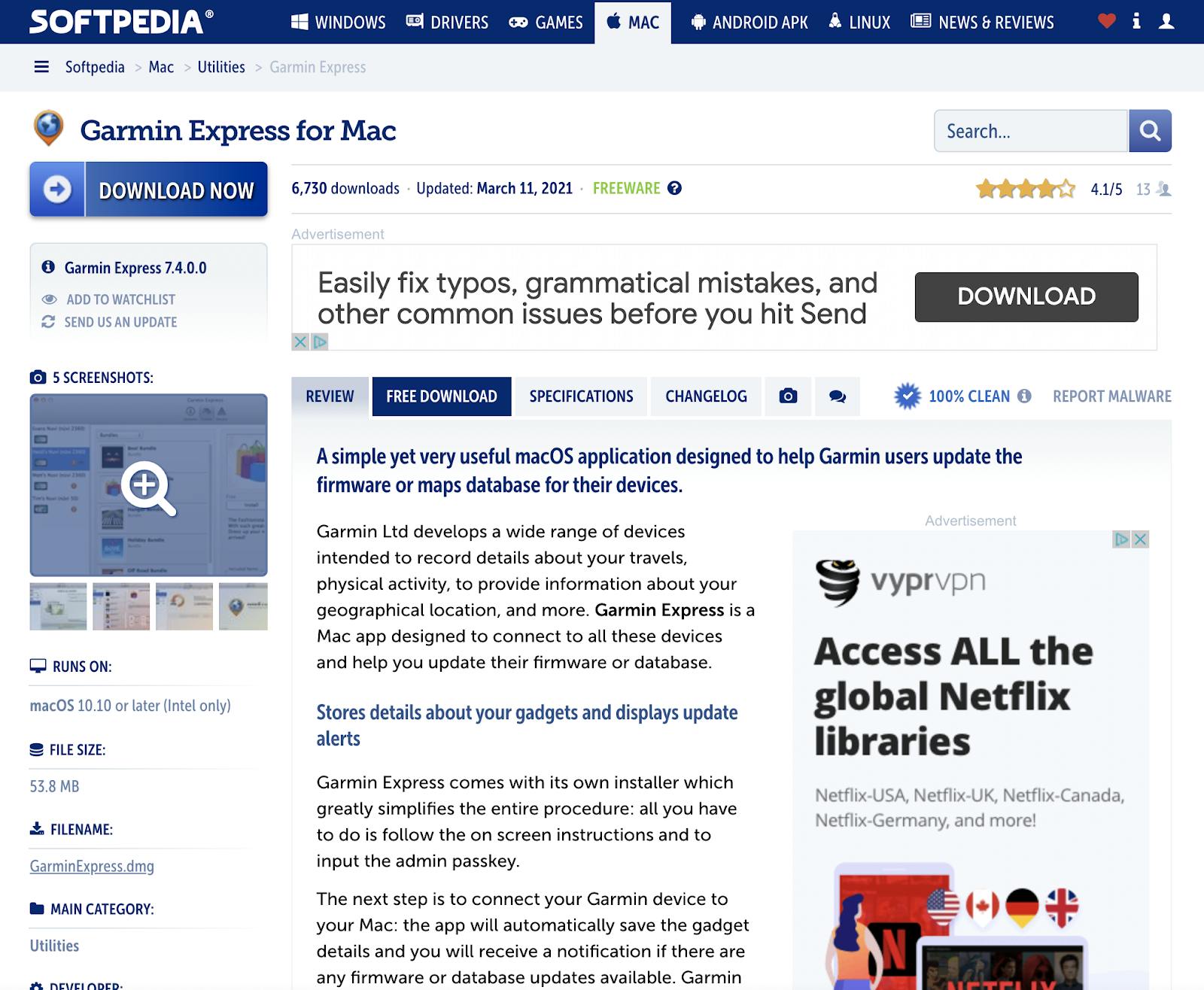
Blue off-placed button is for content. Grey well placed bold button is for advertisement
11. Forced Continuity. This pattern is used in free trials of a paid service when you get charged without prior warning at the end of the trial period. Combines well with some Roach Hotel techniques making the process of canceling your subscription difficult. If you’ve ever subscribed to something and swore up and down that there was no mention of payments recurring, you’ve been a victim of forced continuity.
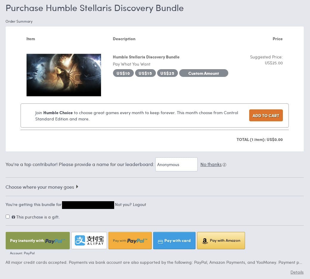
The Add to Cart button leads you to a monthly subscription instead of a once-off payment for the bundle. (via @Metallion98)
12. Friend Spam. Friends come and go. Spam is forever. This pattern involves tricking the users to provide their email or social media permissions under a pretence (ie. connect with friends) and then proceed into spamming all of their connections with emails that appear to be sent directly from the user. A very detailed article from Dan Schlosser describes how Linkedin used to implement this technique. A fine of 13 million dollars as part of a class-action lawsuit in 2015 surely motivated Linkedin to change its practices.
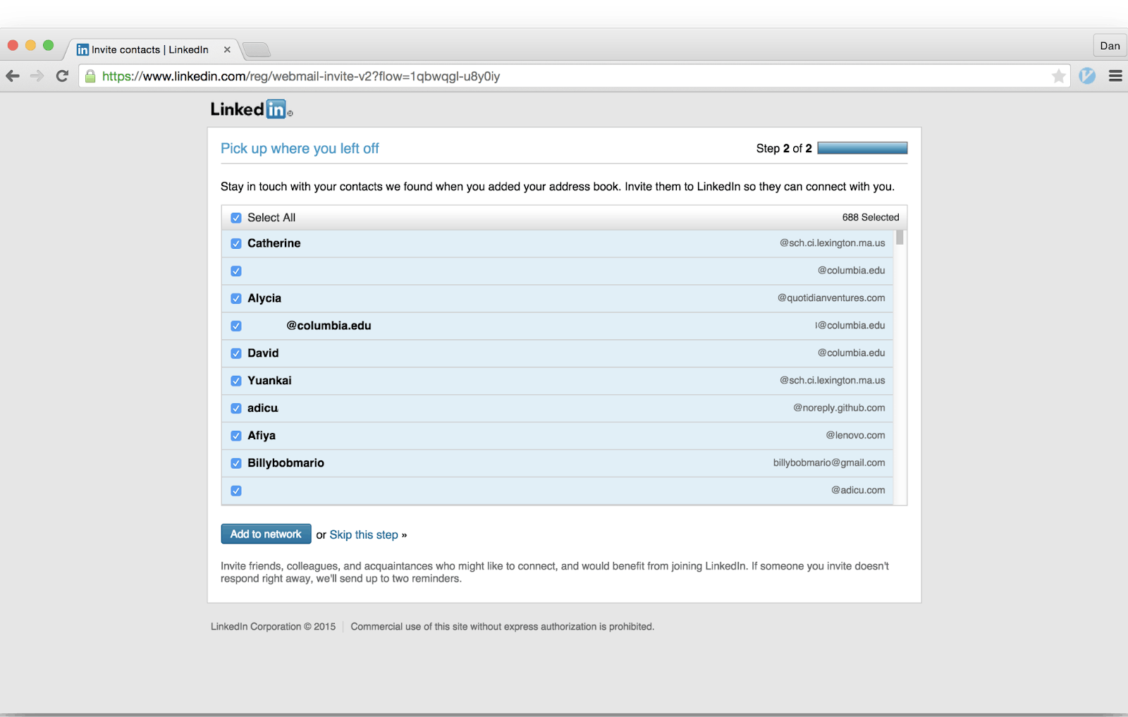
Instead of connecting with 688 people, the result of clicking the Add to Network button was sending spam emails to them informing them that they have been invited to join Linkedin and to connect with the sender.
“The function of the artist is to provide what life does not.”
— Tom Robbins
By no means I imply that UX Designers are artists. Problem solvers suit them more. But they have the power of an artist to create something through creative thinking. So in the modern chaotic world where profit plays an important role, how a designer can create meaningful products that incorporate ethics and motivate the user to behave accordingly?
Well, values can be really handy at this point. According to Joe Edelman of the human-systems.org fame
“Values are ideas that guide us in action. In this, they are similar to plans, goals, fears, intentions, policies, etc, and the like…
…Among these ideas, values alone concern the manner of our actions, rather than the consequences (as with plans, goals, and fears) or the mere fact of their performance (as with intentions, and policies)”.
At this point, we should point out that there are two sets of values: Personal Values and Product Values.
Proposed by Batya Friedman and Peter Kahn Jr. from the University of Washington and adapted by Maheen Sohail in her 2017 article, the values a product can have are (with some examples):
- Health. Refers to a person’s physical, psychological and material state or well-being (ie. a product that can be used by blind persons)
- Ownership. Refers to the right of possessing an object (or information) and the state and act that follow through this ownership (ie clear copyright information at a photo gallery)
- Privacy. Refers to the state of being free from the disturbance of others, the right to determine what information is being communicated to others. (ie. clear privacy policy and easy management of cookies)
- Equality. Refers to the equal treatment between individuals, groups, races, social classes, sexes, (dis)abilities, sexual orientations. (The most famous example was the design of an automatic soap dispenser that was working only on white-colored skins)
- Trust. Refers to the confidence placed in someone or something based on the reliability, truth, strength, skills, and ability to feel vulnerable. (If your product breaks well established UX patterns, breaks the trust as well)
- Autonomy. Refers to an individual’s ability to decide, plan, and act in ways that they believe will help them to achieve their goals independently. (ie. a good informed pricing plan comparison chart)
- Transparency. Refers to the openness and disclosure in agreement or permission granted between individuals or groups (ie. clear terms of service, no sneak in the basket patterns, etc)
- Responsibility. Refers to the ability to act, make decisions, be responsible, and accountable for something (ie easy refunding flow and policy at an e-shop)
- Respect. Refers to being mindful and treating people with politeness and consideration (a digital product’s copywriting is important!)
- Identity. Refers to people’s understanding of who they are over time, embracing both progress and regress over time (ie. clear flows when upgrading or terminating a premium subscription on a digital service)
- Safety. Refers to a peaceful and composed psychological state (use of secure connections on payment getaways)
- Longevity. Refers to sustaining ecosystems to meet the needs of the present without compromising future generations. (That aligns perfectly with Alan Cooper’s vision of being a good ancestor. More on this in a moment)
These are the values of the product. But what about the one that takes the moral decisions? The person that self-identifies as a designer. Is she a good person that loves puppies and helps the elderly cross the road? Is that enough?
Of course, our personal beliefs can’t be set aside. Our view of the world gets inevitably incorporated into the products we create. If that view is distorted then our product will be at some point distorted. Here comes the aforementioned point of view of Mr. Alan Cooper that people are very loyal to good quality and not at all loyal to products that behave badly. So while there is value in making money, there is more value in making the world a better place for our children. We have to be good ancestors!
TLDR
UX Designers have been given (by mistake I swear!) the power to affect user’s everyday life through their choices of solutions offered in a digital product. So, when choices are made sooner or later the eternal question if they were good/moral or bad/immoral arises.
There are numerous dark patterns, using behavioral science, one can use to trick users into making choices that favor the provider of the digital service/product over their own interests. Many of them apply to the physical world also and have been used for years.
It lies on the shoulders of the UX designer to carry the importance of incorporating values into the product. As Steve Jobs said, profit is a byproduct of quality and quality comes not only from beautiful design, impeccable UX flows, and good ideas but also from making a product based on ethical choices. And the most important ethical choice is to inform transparently the user about the digital product and how it works and what to expect. Only then, the user can really make a choice based on his experiences, values, and ethics, thus making the ultimate product UXwise: a product that really suits the User!
